
Listen to the next episode, please.
Tag Archives: News: No News is Good News
No News is Good News
Anything that becomes news sometimes, but only gets reported when it is sensational, scary, or reaches some “crisis” level. This is often statistics-based, and is by nature, boring. However, it is fun to contrast the relative stability that is the status-quo reality of our world with the BREAKING NEWS fever pitch that 24-hour news manages to maintain 24/7.
Lab Leak or Bio-Weapon?
Bio-Weapon?
Update 8 Feb 2021. Binary poison by antibody-dependent enhancement? (ADE) Genetic immune boost (all of the “vaccines” are RNA-based, which is genetic) can be tailored to make a person’s immune system repel a virus or let it in. If you know the immune boost genetic code, you can tailor a virus that is lethal to specific injections. This would explain the motive for pushing the genetic immune boost so hard, or at least muddy the waters of motive. If you release a virus that justifies genetic injections, the long-term bio-war implications of people opening their bodies to RNA are immense.
Motive? While I believe the CCP would do this if they thought it was in their best interest – including to their own people – I do not believe Xi Jinping reached the conclusion in mid-2019 that their best course of action was to gamble and release a virus that threatens the very core of cities, of which China has the most in the world.
Previous Natural Occurrences? A bio-weapon virus would more likely be completely new. It doesn’t explain the previous related novel coronaviruses, one of which started in the Middle East (MERS). Maybe you’ll say of course they would release a natural virus in order to prevent suspicion – OK they take that measure to prevent suspicion, but choose to release it in the same city as the lab? Does not line up.
Accidental Leak from the Wuhan Virus Lab?
The director of the Wuhan lab herself considered this possibility, so it is absolutely reasonable to consider. China did not really conduct an investigation. It is indeed an enormous coincidence that the lab is in Wuhan and everything lines up that it could have leaked. It would not be the first lab leak in history. However, I personally believe in this case it is still more likely it happened naturally like the other two coronavirus epidemics.
The Wuhan Virology Lab, even if just a coincidence, is part of the coronavirus story, see below:
Osterholm asked directly about it by Joe Rogan, click here.
What a BSL-4 lab is, Wuhan is only one in China
1977 Russian flu very likely accidental release from Soviet lab, see Chapter 10 of this book, Deadliest Enemy
1977 Russian flu, see Wikipedia article
1978 Smallpox Outbreak in UK from lab leak
1989 Reston, Virginia laboratory monkey Ebola scare book
2015, Wuhan Virology Lab inaugurated
2017 SARS Virus in Bats by Wuhan Virology Lab Director Zhengli Shi and others
Current: Wuhan Virology Lab Website
Current: Zhengli Shi is the lab director
3 Feb 2020 paper (quickly) says bat origin, lab director Zhengli Shi one of authors
2020, according to this article we are taking the lab director’s word that the virus doesn’t match anything her lab studied. Case closed? Really? This is why people continue to believe it was the lab. We know lab releases have happened before. We know China lies and covers up when necessary.
This is a much better explanation, which, after several months now, I have yet to hear a good challenge.
The CCP knew the lab was going to be a PR nightmare and so probably delayed informing the world about the virus even more than they otherwise would have. The existence of the lab certainly influenced the CCP reaction.
With the amount of asymptomatic spread before being noticed, I am not even convinced 100% it actually started in Wuhan. Wuhan very possibly was just the first place it concentrated enough for the CCP to react.

Real Estate Summary, November 2018
Lawrence Yun is the chief economist for the National Association of Realtors®. He is very straightforward and he applies numbers to what everybody is feeling in the real estate market. This 10 minute interview covers what most people are talking about: a “slow-down” in real estate, rising interest rates, new home building, consumer preferences, etc.

Market Prediction Results, So Right and So Wrong
Check out this timeline of market predictions. I was WRONG. The guy who was right wishes to remain anonymous, so we’ll call him Sven Laarson.
Nate on 9 Dec 2015, S&P 500 = 2,048
Economists are like weathermen. They are barely better than basic observation most of the time. However, they are paying attention, and when a bad storm is imminent, they are going to see it a few hours ahead—long enough to get inside.
I am staying in cash, so here is a specific wager that I will make up to $1000 so I can put my money where my mouth is. I am willing to bet that we will see 1630 (-22%) before we see 2230 (+8%) in the S&P.
Sven on 29 Mar 2016, S&P 500 = 2,055
“Put me down for 2,750 before 1,630. Then we’ll see 1,500 eventually so you’ll get your buying opportunity in the next 30 years. You could miss out though. If it hits 3,300 before the next crash it could never see 1,630 again!
We’re in the first few years right now of the fabled ’15-year bull market’. Could be 20 years. Nothing but up. The dollar will get stronger too (short term, no 15 year bull for the dollar) so watch silver for a good low price to buy on. I’ll start buying at $9 an ounce.
There are less and less obstacles in the way of all markets around the world. Growth will continue even if our local politicians in USA encourage us to vote by convincing us to be divided. Things are going great and America will be made even greater again. The entities involved in the stock market of all entities have no obstacles. The system is built for them and it helps them bring the greatest good to the most people.
Any and every moment could bring a revolutionary invention and it would be available to the whole world within years. With that powering the markets up what could stop our human growth? Almost nothing.
GDP will be measured differently soon to account for all the value we get for free (without triggering a GDP recorded event). E.g. Facebook, Whatsapp, Google, etc. It will show that we are growing at an alarming rate and just not recording it properly. We are accidentally producing less carbon emissions without the great famishes and sacrifices that were warned. Technology. No one needed to force it. The US constitution released human potential. That worked because humans are inherently good. Even in Afghanistan in all out war the vast majority of people just want to work and keep what they earn. With those humans having more access to opportunity than ever in history why would the markets collapse in droves?
It isn’t a deck of cards. It is a rain forest. Very well balanced. Everything is specialized and as a whole the system is diversified (anti-fragile as you say).”
Nate on 15 Dec 2016, S&P 500 = 2,262
“Sven,
The forwarded message is the bet that I offered you guys almost exactly a year ago (I bolded the bet and put it in red). I’m glad you didn’t take it because I would have lost. The S&P closed above 2,230 on 7 December.
Of note, my man Hussman is especially negative this week:
See you guys soon,
Nate”
11 Jan 2018, S&P 500 = 2,768
Sven’s hyper-optimistic prediction of 2,750 from March 2016 came true in under two years. S&P 500 up 35% since the prediction.
June 2018, S&P 500 = 2,718
Nate is glad he invested in other things and didn’t short the market, but remains bearish.
“I still subscribe to the idea that the longer it takes the worse it will be.”
Sven is glad he stayed in the market and remains bullish.
After some discussion, we determined that since we didn’t agree on an amount for the bet, and we didn’t shake hands, only pride was won and lost.
11 Oct 2018, S&P 500 = 2,728
I write this post because the S&P 500 just dropped 152 points in two days and everybody noticed it and talked about it. 2,728 only brings us back to July however. and …
Since the day in December 2015 that I predicted “down 22%,” the S&P 500 is up 33%.
This weatherman is still predicting rain:

Real Estate Summary, July 2018
Average Sale Price
- $238,655, Jul 2018, 4.9% increase 1-yr, 37.2% increase 10-yr
- $227,572, Jul 2017
- $173,940, Jul 2008
The year-over-year increase in price for July 2018 compared with the YoY increase in July 2017 is less, so the increase has slowed. The YoY increase in July 2017 was 6.4%. From the MLS chart, the last time that the price increase was this slow was late 2014, so it appears by that measure the market has cooled off a bit, or is just a bit less hot. The price still increased don’t forget. That is good. The last time there was an overall YoY price decrease was 2011.
Source: http://www.columbusrealtors.com/stats/
Months Supply of Inventory
- 1.9 months, Jul 2018
- 11.2 months, Jul 2010 – highest for July in last 10 years.
- 2.0 months, Jul 2017 – last year’s hot market
We are still in a historical seller’s market.
Source: http://www.columbusrealtors.com/stats/archives.aspx
Interest Rate, 30 Year Fixed-Rate Mortgage
- 4.54%, 6 Sep 2018, most recent
- 4.46%, 8 Mar 2018
- 3.95%, 4 Jan 2018
- 3.41%, 7 Jul 2016, 5-year low
- 6.04%, 20 Nov 2008, the last time rate was over 6%
How much has the 30-year fixed rate gone up? It increased above 4% in January this year, reached 4.46% by March, and has held steady since then. The five year low was 3.41% in July 2016. Check out this interactive chart from Freddie Mac:
http://www.freddiemac.com/pmms/
What To Do, Sellers
Hold tight. The demand is still there.
What To Do, Investors
- Do: Improve / develop what you already own, and get it performing.
- Do: take opportunity to start as a wholesaler / real estate agent / manager.
- Don’t: buy on a variable rate loan.

Real Estate Summary, March 2018
Average Sale Price
- $210,791, Feb 2018, 10.6% increase 1-yr, 34.7% increase 10-yr
- $190,659, Feb 2017
- $156,497, Feb 2008
The average sale price for Feb 2018 has increased 10.6% over Feb 2017. That is the highest percentage increase for February since Feb 2010 vs. Feb 2009, which was an increase of 11.9%.
Source: http://www.columbusrealtors.com/stats/archives.aspx
Months Supply of Inventory
- 1.2 months, Feb 2018
- 12.4 months, Feb 2009 – highest for February in last 10 years.
- 1.6 months, Feb 2017 – last year’s hot market
How much of a seller’s market is it now? 1.2 months is the lowest inventory since Columbus Realtors® started keeping the statistic in Apr 2008. Last year, 2017, the inventory started at 1.6 in January, then peaked at 2.1 in May 2017.
Source: http://www.columbusrealtors.com/stats/archives.aspx
Interest Rate, 30 Year Fixed-Rate Mortgage
- 4.44%, 29 March 2018, most recent
- 4.53%, Jan 2014
- 4.58%, Aug 2013
- 6.04%, 20 Nov 2008, the last time it was over 6%
We are hearing about them! That is how much they’ve gone up. Check out this interactive chart from Freddie Mac:
http://www.freddiemac.com/pmms/
What To Do, Investors
- Do: Improve / develop what you already own, and get it performing.
- Do: take opportunity to start as a wholesaler / real estate agent / manager.
- Don’t: buy on a variable rate loan.

What to Watch 5: Cryptocurrency / Bitcoin, 39 Minutes
Bitcoin 101 by The Wall Street Journal, Dec 2017

The History of Paper Money Part II by Extra Credits History

The History of Paper Money Part VI, The Gold Standard by Extra Credits History

Fiat Money, Explained by Paddy Hirsch

How Bitcoin Works in 5 Minutes by Curious Inventor, Apr 2014

Life Inside a Secret Chinese Bitcoin Mine by Motherboard, Feb 2015

https://bitcoin.org/en/choose-your-wallet
All Nate TV Posts
Nate’s Numbers Hub January 2017
Markets
$2,269 = S&P 500 close 10 Jan 2017 (Yahoo Finance)
28.09 = S&P 500 P/E Ratio on 10 Jan 2017 based on previous 10 years of earnings, AKA “Shiller Ratio,” “CAPE Ratio,” or “PE 10.” (www.multpl.com)
$29.8 trillion = total US market capitalization = $20.2 trillion NYSE + $9.6 trillion NASDAQ
$18.9 trillion = US annual GNP estimate (www.BEA.gov, GDP and the National Income and Product Account (NIPA) Historical Tables, Table 1.7.5)
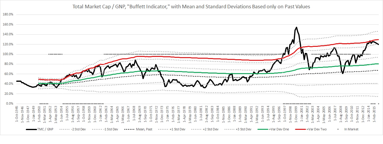
131.2% = “Buffett Indicator” current as of 10 Jan 2017. This number is a variation* on [Total Market Capitalization] / GNP**.
(The calculation is explained here. Numerator obtained from Federal Reserve Bank of St. Louis, current value obtained by extrapolating with the Wilshire 5000 Index. The denominator is obtained from the BEA’s GNP from above. Calculations and chart in this Excel spreadsheet).
*Instead of using actual market cap value, I used “Nonfinancial corporate business; corporate equities; liability, Level” from the Federal Reserve Bank of St. Louis because the data is available since 1945. That number is only reported quarterly, so the Wilshire 5000 index is used to extrapolate to find the current value.
**The GDP is used by some reports instead of GNP, but Buffett uses the GNP. GDP and GNP are very similar, within about 1% of each other, and don’t fluctuate like total market cap does.
 I have to pick an economist. My pick is John P. Hussman. He posts straightforward charts showing strong correlation between current indicators and future results. He uses the S&P 500 to measure performance and he has consistently posted weekly since 2003. All of his posts are available for quick reference: Hussman Funds Weekly Market Comment.
241 = current Consumer Price Index. This number is adjusted so that it averages 100 from 1982-1984. For the first year this number was calculated, 1913, the value was 9.9 (BLS)
1/2-3/4 = target range for the federal funds rate. (www.federalreserve.gov, 14 Dec 2016 FOMC Statement, and bankrate.com)
“Yield Curve” at stockcharts.com
6.93 = Chinese Yuan Renminbi for 1 US dollar (x-rates.com)
My Market Tools, Long-Term to Specific
- Buffett Indicator from above
- My economist pick: John P. Hussman, referenced above.
- Investor’s Business Daily Big Picture
- CANSLIM checklist for picking individual stocks
Energy
All energy data here is in petajoules = 1 quadrillion joules = “1-with-fifteen-zeros” joules, which can quickly be converted to other units of energy for comparison:
1 petajoule =
- 163,456 barrels of oil, energy from (BOE)
- 277.8 gigawatt-hours = 277,800,000 kilowatt-hours
- 0.02388 million tonnes of oil equivalents (MTOE)
- 0.0009478 quadrillion British Thermal Units (BTU)
- 0.0009202 trillion cubic feet of natural gas, energy from (based on 1,030 BTU / cubic foot, IEA website)
395,000 petajoules = 2014 global energy consumption estimate (International Energy Agency, Key World Statistics 2016)
102,704 petajoules = 2015 US energy consumption estimate, 26.0% of global total (US Energy Information Administration Annual Energy Review, Table 1.1)
See also the US energy flow graph, Section 1.0, for a visualization of energy use.
9,911,000 petajoules = energy contained in the 1,620 billion barrels of proved world petroleum reserves (US Energy Information Administration), using the above conversion as an estimate of the energy equivalent.
7,153,000 petajoules = energy contained in the 6,582 trillion cubic feet of proved world natural gas reserves (US Energy Information Administration). This is probably a very rough estimate because of variance in the energy contained in different natural gas.
$50.82 / barrel = current price of WTI crude oil (US EIA) = $8,307,000 / petajoule of energy
$3.41 / million BTU = Henry Hub spot price of energy from natural gas (US EIA) = $3,232,000 / petajoule from natural gas
8.307 / 3.232 = 2.6: oil energy currently costs 3.4 times as much as natural gas energy.
Commodities
$1,188 = price of one ounce of gold (goldprice.org)
$16.74 = price of one ounce of silver (goldprice.org)
1,188 / 16.74 = 71, current gold-silver ratio, historical range of 14 – 100 since 1975 (goldprice.org charts)
Jobs
324 million = total US population (US Census Bureau Population Clock)
251 million = US civilian noninstitutional population
59.0% = employment-population ratio, which is the percentage of civilian noninstitutional population who are employed. Total employed is 148 million people. This is 45.7% of the total population.
5.3% = “unemployment rate” the most-often-reported percentage that excludes people who are not seeking employment, whether receiving unemployment benefits, welfare, or otherwise.
Click here for historical employment numbers. For more detail in easy-to-read charts, see “Charting the Labor Market.” The data is also broken down regionally and by state.
(US Department of Labor, Bureau of Labor Statistics Current Population Survey, November 2015)
President Trump’s First 100 Days
Donald Trump is (or will be on 20 January) the most powerful man on the planet. He released two pages outlining what actions he is going to take in his first 100 days in office, his 100-Day Action Plan to Make America Great Again on his website in late October. Let’s see how he does.
Here is a link to the pdf that I downloaded around the time of the election.
Here is a link to where you can download it directly from his site. (same document, different place)
8 November 2016: Trump elected.
15 Nov 2016: President-elect Trump announces presidential inaugural committee leadership. Unrelated to the plan, just preparing for the inauguration.
21 Nov 2016: President-elect Trump releases video message. The video is just over 2 minutes. He reiterates items directly from the plan.
18 Jan 2017: two days before the inauguration, Trump does an interview with Fox News. Most of the talk was about the inauguration. From the election through today, there were 3 main focuses in the media and from Trump:
- Trump selecting cabinet members
- The media trying to make stories out of very little actually happening
- Trump tweeting and responding to the media on Twitter.
23 Jan 2017: Sean Spicer’s first White House press briefing, work day one.
- Trump has already withdrawn from the Trans-Pacific Partnership.
- He has revived two proposed oil pipelines, the Keystone and Dakota. (I don’t personally support this, but he signed something that allowed them to go forward).
- He reiterated his intention to withdraw from NAFTA, but that there is a procedure that has to be followed in accordance with the deal.
- He reiterated his intent to repeal the Affordable Care Act.
- There were no specifics yet, but he reiterated his intent to make deals that allow businesses to create jobs.
- He still intends to build a wall on the Mexican border. Sean Spicer continued the focus on illegal immigrants who have committed crimes per the 100-day plan.
Many of the questions at the briefing sound stupid. Initially, I hesitated to make that judgement because the reporters must be well-vetted to even be in the room. Then one of the reporters (named “Shane,” no further ID stated) referred to the “First Day Action Plan,” and asked why Trump didn’t address everything on the plan on the first day. That subject I am familiar with and I am 100% sure it’s an incredibly stupid question. It’s a 100-day plan, not a 1-day plan. I’m really surprised they don’t suspend reporters’ privilege of being in that room sometimes and replace them with competent people.
Trump still believes there were millions of illegal voters in the election.
28 Jan 2017: I am not going to continue to follow this contract. It just takes too much time. In attempting to follow, I have heard various reporters say that it is difficult and it is their full-time job. I will return to the subject on 30 Apr to check the results.
In searching for the truth on this subject, the best source I found was to search “Sean Spicer” on YouTube. A good portion of what the media talks about comes from the White House spokesman. I am certainly not suggesting agree with everything that he says, but if you get the information second-hand it is often not even recognizable from what Sean Spicer actually said.
Another source, and I know this hurts, is to follow Trump on Twitter. Like it or not, fact: the president of the United States tweets daily. The media talks about it. If you’re going to hear them talk about it, you should know what they’re talking about.
That is obviously only one side. For dissenting opinions, I look for Trump’s own people because they don’t have ulterior motives to dissent. Secretary of Defense General Mad Dog Mattis’ dissenting opinion on the use of torture is a good example so far.
Two other sources from the past that appear genuine are his former employees Louise Sunshine and Hayley Strozier. They tell unflattering stories that appear to be true while they don’t appear to be gaining personally from it.
What I believe are unifying truths in this situation are that we don’t have a unifying purpose. Had Obama succeeded at his agenda, half the country didn’t want it. He talked smoothly of unification and “crossing the aisle,” but to me and many people, he was divisive in his own way. Trump is openly hostile, and I thought that, counter-intuitively, maybe this approach would have the opposite effect by making it a badge of honor to get along with the big bad Trump. That is a stretch I know! So far, that does not appear to be the result.
What are we doing? What is success?
So we lack a unifying purpose at the national level: we need to invest personally in our local communities! People are already doing this. You probably already are. Turn off the TV, and feel good about it! Embrace your sense of purpose!
…
30 April 2017: His first 100 days are complete.
Nate’s Numbers Hub December 2015
Markets
$2,091 = S&P 500 close 4 Dec 2015 (Yahoo Finance)
26.09 = S&P 500 P/E Ratio on 7 Dec 2015 based on previous 10 years of earnings, AKA “Shiller Ratio,” “CAPE Ratio,” or “PE 10.” (www.multpl.com)
$26.1 trillion = total US market capitalization = $18.7 trillion NYSE + $7.4 trillion NASDAQ
$18.3 trillion = annual US GNP estimate (www.BEA.gov, GDP and the National Income and Product Account (NIPA) Historical Tables, Table 1.7.5)
121.5% = “Buffett Indicator” current as of 7 December 2015. This number is a variation* on [Total Market Capitalization] / GNP**.
(The calculation is explained here. Numerator obtained from Federal Reserve Bank of St. Louis, current value obtained by extrapolating with the Wilshire 5000 Index. The denominator is obtained from the BEA’s GNP from above. Calculations and chart in this Excel spreadsheet).
*Instead of using actual market cap value, I used “Nonfinancial corporate business; corporate equities; liability, Level” from the Federal Reserve Bank of St. Louis because the data is available since 1945. That number is only reported quarterly, so the Wilshire 5000 index is used to extrapolate to find the current value.
**The GDP is used by some reports instead of GNP, but Buffett uses the GNP. GDP and GNP are very similar, within about 1% of each other, and don’t fluctuate like total market cap does.
I have to pick an economist. My pick is John P. Hussman. He posts straightforward charts showing strong correlation between current indicators and future results. He uses the S&P 500 to measure performance and he has consistently posted weekly since 2003. All of his posts are available for quick reference: Hussman Funds Weekly Market Comment.
236 = current Consumer Price Index. This number is adjusted so that it averages 100 from 1982-1984. For the first year this number was calculated, 1913, the value was 9.9 (BLS)
0-1/4 = target range for the federal funds rate. (www.federalreserve.gov, 28 Oct 2015 FOMC Statement, and bankrate.com)
“Yield Curve” at stockcharts.com
6.42 = Chinese Yuan Renminbi for 1 US dollar (x-rates.com)
My Market Tools, Long-Term to Specific
- Buffett Indicator from above
- My economist pick: John P. Hussman, referenced above.
- Investor’s Business Daily Big Picture
- CANSLIM checklist for picking individual stocks
Energy
All energy data here is in petajoules = 1 quadrillion joules = “1-with-fifteen-zeros” joules, which can quickly be converted to other units of energy for comparison:
1 petajoule =
- 163,456 barrels of oil, energy from (BOE)
- 277.8 gigawatt-hours = 277,800,000 kilowatt-hours
- 0.02388 million tonnes of oil equivalents (MTOE)
- 0.0009478 quadrillion British Thermal Units (BTU)
- 0.0009202 trillion cubic feet of natural gas, energy from (based on 1,030 BTU / cubic foot, IEA website)
389,000 petajoules = 2013 global energy consumption estimate (International Energy Agency, Key World Statistics 2015)
103,000 petajoules = 2013 US energy consumption estimate, 26.5% of global total (US Energy Information Administration Annual Energy Review, Table 1.1)
See also the US energy flow graph, Section 1.0, for a visualization of energy use.
10,100,000 petajoules = energy contained in the 1,656 billion barrels of proved world petroleum reserves (US Energy Information Administration), using the above conversion as an estimate of the energy equivalent.
7,578,000 petajoules = energy contained in the 6,973 trillion cubic feet of proved world natural gas reserves (US Energy Information Administration). This is probably a very rough estimate because of variance in the energy contained in different natural gas.
$39.93 / barrel = current price of WTI crude oil (US EIA) = $6,527,000 / petajoule of energy
$2.11 / million BTU = Henry Hub spot price of energy from natural gas (US EIA) = $1,942,000 / petajoule from natural gas
6.527 / 1.942 = 3.4: oil energy currently costs 3.4 times as much as natural gas energy.
Commodities
$1,086 = price of one ounce of gold (goldprice.org)
$14.54 = price of one ounce of silver (goldprice.org)
1,086 / 14.54 = 75, current gold-silver ratio, historical range of 14 – 100 since 1975 (goldprice.org charts)
Jobs
322 million = total US population (US Census Bureau Population Clock)
252 million = US civilian noninstitutional population
59.3% = employment-population ratio, which is the percentage of civilian noninstitutional population who are employed. Total employed is 149 million people. This is 46.2% of the total population.
5.0% = “unemployment rate” the most-often-reported percentage that does not include people who are not seeking employment, whether receiving unemployment benefits, welfare, or otherwise.
Click here for historical employment numbers. For more detail in easy-to-read charts, see “Charting the Labor Market.” The data is also broken down regionally and by state.
(US Department of Labor, Bureau of Labor Statistics Current Population Survey, November 2015)