Meaningful perspective on statistics that are often presented as secondary support to an obvious political bias, where the only context a typical viewer extracts is the presentation of the particular “story.” To give perspective, I pause the few minutes required to convert to common units, and use simple arithmetic to compare with historical numbers or compare very large numbers to something similarly large that makes common sense. The result is usually less alarming than the “news” would have you believe, but sometimes the result is actually more alarming and you wonder why they aren’t trumpeting the story even more.
Average salinity: 0.035 Kg salt per Kg water, so 3.5% by mass.
The oceans are 272x the mass of the atmosphere.
Specific Heat
Specific heat of “air” at 250K is 1005 J/KgK
Specific heat of ocean water is ~4000 J/KgK
Total Heat Capacity
Total heat capacity of the atmosphere: 5.2×10²¹ J/K
Total heat capacity of the oceans: 5.6×1024 J/K
The heat capacity of the oceans is ~1,077x the heat capacity of the atmosphere.
I think it’s interesting that the ocean is only 272x the mass of the atmosphere. That is knowable intuitively if you know the approximate pressure deep-sea subs deal with or know that 10m of water is equal to about 1 atmosphere of presure.
Another interesting scale to put in perspective is that the hydrosphere is about 0.023% of Earth’s total mass. So the Earth mass is about the mass of 4,300 oceans.
Somebody in New York has a data project that correlates market news articles to future market moves / short-term volatility. Somebody knows the strength of this correlation and they place their bets accordingly. If the correlation is strong enough, then they are creating the news stories. If it is weak, they are ignoring the news.
What is the cause-effect relationship among news, market moves, and actual events?
Some Cause-Effect Possibilities
A.
1. Something happens.
2. News reports it.
3. Market moves.
1. Market moves by wild mob.
2. News reports mostly random speculation / is along for the wild ride.
3. Hedge funds win and lose along with the rest of us, just more in a more complex way.
D.
1. The largest market players have incorporated creating news into their big data market-controlling strategy.
2. Big money / big data analysis creates news stories that create profitable market moves.
3. Market reacts with short-term volatility, biggest hedge funds profit.
A is the ostensible assumption. D is the most cynical. I suspect it is pretty close to option C really, but I don’t know. We as outsiders do not know the answer and I suspect the real answer is a combination. As usual, it depends!
On Market “News”
Misinformation is as bad as lack of information.
The question, “what are reporters saying,” yields infinite random information of unknown value – and therefore zero value.
Speculation is free. The only incentive for someone selling news is to say something alarming and attention-grabbing.
The question, “where are people actually putting their money,” yields better information. However, the average outsider investor can only know where the money really went after it happens.
Where Should I Put My Money?
Short-term, only the most inside people know “real” value of individual investments. No single individual knows the “real” value of every individual stock, hence the “market.”
Long-term, there is a strong incentive by all major parties for the market to go up. This applies to value creation by companies as well as the more cynical policy setting by governments. Therefore buy-and-hold works. Ride the bandwagon!
If you can, put your money right in front of you where it can enhance your own value creation / attention / effort. In other words, put your money where you are the “insider.” If you can, be the insider.
But I’m Curious What’s Happening
Okay, then do not ask the question, “What is the news saying about the market.”
Instead start with the question, “Where has the market gone?” This at least starts you off by knowing where people actually have placed their collective substantive opinion.
Check out this timeline of market predictions. I was WRONG. The guy who was right wishes to remain anonymous, so we’ll call him Sven Laarson.
Nate on 9 Dec 2015, S&P 500 = 2,048
Economists are like weathermen. They are barely better than basic observation most of the time. However, they are paying attention, and when a bad storm is imminent, they are going to see it a few hours ahead—long enough to get inside.
I am staying in cash, so here is a specific wager that I will make up to $1000 so I can put my money where my mouth is. I am willing to bet that we will see 1630 (-22%) before we see 2230 (+8%) in the S&P.
“Put me down for 2,750 before 1,630. Then we’ll see 1,500 eventually so you’ll get your buying opportunity in the next 30 years. You could miss out though. If it hits 3,300 before the next crash it could never see 1,630 again!
We’re in the first few years right now of the fabled ’15-year bull market’. Could be 20 years. Nothing but up. The dollar will get stronger too (short term, no 15 year bull for the dollar) so watch silver for a good low price to buy on. I’ll start buying at $9 an ounce.
There are less and less obstacles in the way of all markets around the world. Growth will continue even if our local politicians in USA encourage us to vote by convincing us to be divided. Things are going great and America will be made even greater again. The entities involved in the stock market of all entities have no obstacles. The system is built for them and it helps them bring the greatest good to the most people.
Any and every moment could bring a revolutionary invention and it would be available to the whole world within years. With that powering the markets up what could stop our human growth? Almost nothing.
GDP will be measured differently soon to account for all the value we get for free (without triggering a GDP recorded event). E.g. Facebook, Whatsapp, Google, etc. It will show that we are growing at an alarming rate and just not recording it properly. We are accidentally producing less carbon emissions without the great famishes and sacrifices that were warned. Technology. No one needed to force it. The US constitution released human potential. That worked because humans are inherently good. Even in Afghanistan in all out war the vast majority of people just want to work and keep what they earn. With those humans having more access to opportunity than ever in history why would the markets collapse in droves?
It isn’t a deck of cards. It is a rain forest. Very well balanced. Everything is specialized and as a whole the system is diversified (anti-fragile as you say).”
Nate on 15 Dec 2016, S&P 500 = 2,262
“Sven,
The forwarded message is the bet that I offered you guys almost exactly a year ago (I bolded the bet and put it in red). I’m glad you didn’t take it because I would have lost. The S&P closed above 2,230 on 7 December.
Of note, my man Hussman is especially negative this week:
Sven’s hyper-optimistic prediction of 2,750 from March 2016 came true in under two years. S&P 500 up 35% since the prediction.
June 2018, S&P 500 = 2,718
Nate is glad he invested in other things and didn’t short the market, but remains bearish.
“I still subscribe to the idea that the longer it takes the worse it will be.”
Sven is glad he stayed in the market and remains bullish.
After some discussion, we determined that since we didn’t agree on an amount for the bet, and we didn’t shake hands, only pride was won and lost.
11 Oct 2018, S&P 500 = 2,728
I write this post because the S&P 500 just dropped 152 points in two days and everybody noticed it and talked about it. 2,728 only brings us back to July however. and …
Since the day in December 2015 that I predicted “down 22%,” the S&P 500 is up 33%.
2,000 food Calories = 8.4 million joules = approximate energy usage of the human body in one day
One Tesla Model S battery charge ~ 36x this amount
One 2017 Honda Civic gas tank ~ 177x this amount
Typical furnace (100,000 BTU / hr rating) operating for 1 hour ~ 12x this amount
US energy usage per day (referenced in my post here) ~ 33.5 billion x this amount, or ~ 102x the US population*
Global energy usage per day (referenced in my post here) ~ 129 billion x this amount, or ~ 17x the global population*
*Relating the energy consumption of the modern world per person to the energy consumption of just the human body by itself is ambiguous, I realize. However, it puts in context the massive numbers that are constantly thrown around in the media on this subject, and consolidates the hype and various units into one unit.
I recently heard these five companies referred to as “The Big Five.” You have heard of each of these companies. You have done business with at least one of them (or you are in a coma of course).
If you are a person who considers single entities that are too powerful to be a threat, then these collectors of our information would be a threat. How do they compare in size to the US government?
Apple
$220.46 billion = annual revenue
Amazon
$142.57 billion = annual revenue
Google (Alphabet, Inc.)
$94.76 billion = annual revenue
Microsoft
$87.25 billion = annual revenue
Facebook
$30.29 billion = annual revenue
US Government
$3,200 billion = annual tax revenue
Comparison
The total revenue of the five companies combined equals just under 18% of the US government’s tax revenue. Apple’s revenue by itself is 6.9% of the US government’s revenue. They have not passed the government, but they are starting to be in the ballpark.
What They Know, Snapshot
Apple and Microsoft’s operating systems account for most of our computers. Google controls our internet searches, and Android, and YouTube, and many of our e-mails. Amazon knows what we buy. Facebook knows the rest.
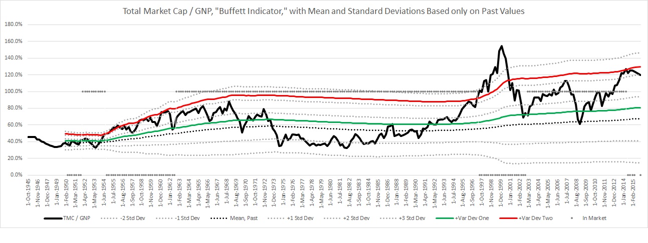
*Instead of using actual market cap value, I used “Nonfinancial corporate business; corporate equities; liability, Level” from the Federal Reserve Bank of St. Louis because the data is available since 1945. That number is only reported quarterly, so the Wilshire 5000 index is used to extrapolate to find the current value.
**The GDP is used by some reports instead of GNP, but Buffett uses the GNP. GDP and GNP are very similar, within about 1% of each other, and don’t fluctuate like total market cap does.
I have to pick an economist. My pick is John P. Hussman. He posts straightforward charts showing strong correlation between current indicators and future results. He uses the S&P 500 to measure performance and he has consistently posted weekly since 2003. All of his posts are available for quick reference: Hussman Funds Weekly Market Comment.
241 = current Consumer Price Index. This number is adjusted so that it averages 100 from 1982-1984. For the first year this number was calculated, 1913, the value was 9.9 (BLS)
6.93 = Chinese Yuan Renminbi for 1 US dollar (x-rates.com)
My Market Tools, Long-Term to Specific
Buffett Indicator from above
My economist pick: John P. Hussman, referenced above.
Investor’s Business Daily Big Picture
CANSLIM checklist for picking individual stocks
Energy
All energy data here is in petajoules = 1 quadrillion joules = “1-with-fifteen-zeros” joules, which can quickly be converted to other units of energy for comparison:
See also the US energy flow graph, Section 1.0, for a visualization of energy use.
9,911,000 petajoules = energy contained in the 1,620 billion barrels of proved world petroleum reserves (US Energy Information Administration), using the above conversion as an estimate of the energy equivalent.
7,153,000 petajoules = energy contained in the 6,582 trillion cubic feet of proved world natural gas reserves (US Energy Information Administration). This is probably a very rough estimate because of variance in the energy contained in different natural gas.
$50.82 / barrel = current price of WTI crude oil (US EIA) = $8,307,000 / petajoule of energy
$3.41 / million BTU = Henry Hub spot price of energy from natural gas (US EIA) = $3,232,000 / petajoule from natural gas
8.307 / 3.232 = 2.6: oil energy currently costs 3.4 times as much as natural gas energy.
251 million = US civilian noninstitutional population
59.0% = employment-population ratio, which is the percentage of civilian noninstitutional population who are employed. Total employed is 148 million people. This is 45.7% of the total population.
5.3% = “unemployment rate” the most-often-reported percentage that excludes people who are not seeking employment, whether receiving unemployment benefits, welfare, or otherwise.
In this post, I put the numbers that we as individuals can know with reasonable certainty in perspective. I cannot say based on these numbers whether man-made climate change is or is not happening. What I can say is that the numbers show human carbon transfer is large enough to possibly have an effect. Because I believe the burden of proof should be on those saying there is no change, then I assume man is affecting the global climate.
Below are some numbers to put our effect as humans in perspective. I have heard both sides of this polarizing issue for a long time, and have been meaning to put some numbers to my own intuition. I chose numbers that can be intuitively understood and, though they are estimates, can be measured fairly directly. As far as I know, the following is not seriously in dispute.
Reference for Perspective
5.15 x 10¹⁸ Kg = total mass of the atmosphere.
3.0 x 10¹⁵ Kg = total mass of CO2 in the atmosphere.
The following macro numbers are so huge as to be meaningless without some reference for scale. I use this quantity, 3.0 x 10¹⁵ Kg, total mass of CO2 in the atmosphere, simply to compare to other huge numbers to get some perspective. They are not directly related to each other within the equilibrium.
CO2 Concentration in the Atmosphere
0.0582% = CO2 in the atmosphere by weight. It makes up a very small portion of the atmosphere.
The amount of CO2 released by humans can be measured fairly accurately. Annually, it equals ~1.2% of the total weight of CO2 in the atmosphere. This is not to be confused with a ratio comparing to the amount of CO2 released naturally annually. We are one source of many in an equilibrium. Though that would be a more meaningful ratio, I did not use it because the amount released and consumed naturally cannot be measured as directly, and is beyond the scope of this post. I stick to numbers that I can know and verify with reasonable certainty.
The amount released by humans since the beginning of the industrial revolution can also be estimated. This equals ~67% of the total CO2 in the atmosphere. This is the best I can do as an individual debating this topic, but the total we have poured into the atmosphere over that amount of time is like measuring the amount of water you put into a bucket with a big leak. How much is still in the bucket? It depends on the leak!
My conclusion: the amount that humans release is not massively alarming in proportion. I cannot prove or disprove man-made climate change. However, it certainly is a relevant amount, we should pay attention to it, and I personally believe man-made global climate change is happening.
The Volcano Effect
~200 x 109 Kg = mass of CO2 that volcanoes release annually on average. This number is widely disputed, and is known to be not well measured.
The CO2 released by volcanoes continuously is less than 1% of the amount released by humans continuously, based on this estimate. How much does a big eruption produce? …
The Tambora Eruption of 1815
Regardless of what you believe, you have to read about this! The magnitude is unbelievable. Fun to read about.
What is the long-term effect of one huge volcano? How does that compare to our human effect? I do not know.
My Opinion
I personally believe that yes, the earth is warming because we continuously release significant amounts of CO2 into the atmosphere. It makes common sense. Almost everything we do releases CO2. More CO2 changes the reflective properties of the atmosphere. The greenhouse effect as a concept is a proven fact. If it is possible to change the temperature by adding CO2, we are doing everything we can to make it happen.
What do I think we should do? What do I think government policy should be? Regardless of climate change, I believe that reducing dependency on carbon-based fuels is a worthy challenge. Regardless of climate change! Even though I believe global warming is happening, I can’t prove it. Nobody can. Even if it can be proven, can we stop it or reverse it? Well, who cares? Alternatives are cleaner, more renewable, and we could use a good challenge anyway! I think the government should set policy–yes including raising taxes on carbon-based fuels–such that the price is at a level where people have to make significant life choices to economize, but can still live comfortably. For example, car pooling and public transportation are a lot more attractive at $5 / gallon than at $2 / gallon. This simultaneously buys time to find alternate solutions, spurs market ingenuity, provides a meaningful challenge that encourages people to work together, and even supports national security by reducing dependency.
*Instead of using actual market cap value, I used “Nonfinancial corporate business; corporate equities; liability, Level” from the Federal Reserve Bank of St. Louis because the data is available since 1945. That number is only reported quarterly, so the Wilshire 5000 index is used to extrapolate to find the current value.
**The GDP is used by some reports instead of GNP, but Buffett uses the GNP. GDP and GNP are very similar, within about 1% of each other, and don’t fluctuate like total market cap does.
Buffett Indicator chart with various standard deviation lines based only on past data.
I have to pick an economist. My pick is John P. Hussman. He posts straightforward charts showing strong correlation between current indicators and future results. He uses the S&P 500 to measure performance and he has consistently posted weekly since 2003. All of his posts are available for quick reference: Hussman Funds Weekly Market Comment.
236 = current Consumer Price Index. This number is adjusted so that it averages 100 from 1982-1984. For the first year this number was calculated, 1913, the value was 9.9 (BLS)
6.42 = Chinese Yuan Renminbi for 1 US dollar (x-rates.com)
My Market Tools, Long-Term to Specific
Buffett Indicator from above
My economist pick: John P. Hussman, referenced above.
Investor’s Business Daily Big Picture
CANSLIM checklist for picking individual stocks
Energy
All energy data here is in petajoules = 1 quadrillion joules = “1-with-fifteen-zeros” joules, which can quickly be converted to other units of energy for comparison:
See also the US energy flow graph, Section 1.0, for a visualization of energy use.
10,100,000 petajoules = energy contained in the 1,656 billion barrels of proved world petroleum reserves (US Energy Information Administration), using the above conversion as an estimate of the energy equivalent.
7,578,000 petajoules = energy contained in the 6,973 trillion cubic feet of proved world natural gas reserves (US Energy Information Administration). This is probably a very rough estimate because of variance in the energy contained in different natural gas.
$39.93 / barrel = current price of WTI crude oil (US EIA) = $6,527,000 / petajoule of energy
$2.11 / million BTU = Henry Hub spot price of energy from natural gas (US EIA) = $1,942,000 / petajoule from natural gas
6.527 / 1.942 = 3.4: oil energy currently costs 3.4 times as much as natural gas energy.
252 million = US civilian noninstitutional population
59.3% = employment-population ratio, which is the percentage of civilian noninstitutional population who are employed. Total employed is 149 million people. This is 46.2% of the total population.
5.0% = “unemployment rate” the most-often-reported percentage that does not include people who are not seeking employment, whether receiving unemployment benefits, welfare, or otherwise.
$0.40 trillion = interest expense on US government outstanding debt, fiscal year 2015 (www.treasurydirect.gov)
0.40 / 18.7 = 2.1% average annual interest rate on the national debt
0.40 / 3.2 = 12%, interest expense as a percentage of tax revenue
$3.53 trillion = currency exchange reserves held by the Chinese government as of Oct 2015 (www.tradingeconomics.com) This has been steadily decreasing since it peaked at $3.99 trillion in mid-2014.
$4.25 trillion = money supply inflation as of Nov 2015 by the practice of quantitative easing (www.federalreserve.gov with data interpretation help by Wikipedia) This amount has been relatively steady since Oct 2014.
All of the US government numbers come directly from balance sheets available on .gov sites. It was calming to find the numbers I’ve heard about in the news on a regular old balance sheet. I don’t think I will rush to cash in my savings bond.